

Thumbnail sketch for "The Man in the Moon"
thumbnail sketch
"The Man in the Moon" was originally designed as a figurine, which, unfor-tunately, never got made. I liked the composition, however, and thought it was a good start towards a finished piece in the Nursery Rhyme book.
Regardless of whether I'm designing a two or three-dimensional project, I like to start with a series of thumbnail sketches
I try to develop at least two or three ideas that I can present to my client. The importance of trying more than one approach is that even if I'm happy with the first attempt, by working with the subject matter a little further, sometimes I'll find a fresher approach in the second or third try.
I tend to have a favorite, and often that is the one that gets picked, but sometimes I'll be surprised by the choice!

Rough sketch
rough sketch
In the rough sketch stage, I'm trying to find the composition, and get a feel for whether or not my idea will work out graphically.
This is usually a fun, "looser" stage, where I'm trying to capture the essence of the idea.

Final drawing for figurine
final drawing for figurine
This is a copy of the final drawing for the figurine. The cloud base was to act as the support to the main characters, and I'm trying to make the figurine pleasing to view from every angle.
I was inspired by an astrolabe that I found at a Rennaisance fair for the inside of the moon - something an ancient astrologer might have found helpful!

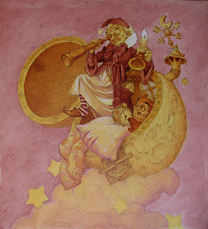
Value study and page layout
value study and page layout
This is a "rough" page layout, showing the illustration fitting into a double-page spread format for the Nursery Rhyme book. As you can see, I have used the final drawing from the figurine, but now it has been cropped to fit the space allocated for the illustration.
The layout shows the intended position of the rhyme, gutter (center of the spread), borders, and the outer lines indicating the page trim. (This early indication of the type treatment and layout was redesigned by Mr. Bjorn Akselsen in the final production of the book.)
At this stage, I have also added shading in the background of the illustration, which completes the value study. This becomes very important information which helps me determine the tonal values prior to painting.
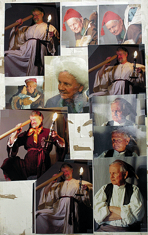

photo reference
Once the basic composition has been approved, I assemble reference material and, if necessary, take photos of models for the main characters. These folks tend to be friends and family members who will be good sports about dressing up in costumes. As you can see, I have also been known to pose myself!
In terms of reference, since I usually take a lot of photographs wherever I travel, I already have various files for things like architectural details, costumes and landscapes that I can draw on for different compositions.
I group photos together on photo boards that will help me determine which details I'll want to include to tighten up my final drawing.
It wasn't necessary for "The Man in the Moon," but in some cases, I've sculpted models in Sculpey for characters, or set up still life arrangements that I can draw to get the background elements to look realistic. I have also purchased a few mannequins that can also be dressed up for reference.
Taking my own photos works well, but nothing really takes the place of drawing from life, under controlled lighting. It's still the best way to really get a feel for what something looks like.

Preliminary Rough
preliminary rough
Even though this might look exactly like the drawing in the value study, it actually incorporates subtle differences that were redrawn after I had the new photo reference. For example, the final tilt of the character's body has changed, along with the positioning of the hands and foot.
In addition, other elements, like the owl and the clock, have been enlarged for greater emphasis. Also, elements like the quilt and pillow have been redrawn based on the photo reference. The details on the inside of the moon also needed to be refined.
One element that didn't change in this step was the face. I liked it enough from the first stage, so it was reused.
In this way, individual elements of the picture are refined and resized by using my copier machine, and the final result is a combination of both xeroxed and drawn elements - which then get pasted up (or in my case, waxed) onto one sheet of layout paper.
I'd rather have all of the elements just the way I want them at this stage, and create a composite - rather than to have one" final" drawing done on one layer.

Final drawing
final drawing
Here is a photocopy of the final pencil drawing. All the drawn information that I'll need for the painting is here.
This is strictly linear, which makes it easy to transfer to the gessoed, masonite panel. I'll refer to the earlier value study for the shading effects I'll want in the painting.

Color study
color study
Once the drawing is on the final surface, I work on a small color study, which is a smaller, xerox copy of the final drawing. This is a great time saver in the long run, as the major color scheme is established on a small scale, prior to working on the finish.
It's often the case that certain color combinations that I'm thinking about in the sketch phase simply won't work well in this color study, and by laying acetate over such attempts, I can easily block in new colors to try different approaches.
I'll keep this color study at the top of my easel when I'm painting, as a reminder of the final color scheme.

Imprimatura
IMPRIMATURA
When I paint, it's ususally a combination of working with the imprimatura and underpainting, and working against it. In other words, there are times when I try to keep those layers coming through by painting transparently on top of them, or there will be times when I completely obliterate them by painting over them with an opaque color. But regardless, the tones and colors of the imprimatura and underpainting have a profound effect on the final painting.
In this painting, I used burnt sienna and yellow ochre acrylic paint for the imprimatura. This provided the base for the subsequent layers in oil.
One of the best definitions I have found to describe the painting stage called "Imprimatura," was on Wikipedia. Since I couldn't describe it better, here's a portion of the text:
"Imprimatura is a term used in painting, meaning an initial stain of color painted on a ground. It provides a painter with a transparent toned ground, which will allow light falling onto the painting to reflect through the paint layers.
The term itself stems from the Italian and literally means ¨first paint layer."
The imprimatura provides not only an overall tonal optical unity in a painting but is also useful in the initial stages of the work, since it helps the painter establish value relations from dark to light.
It is most useful in the classical approach of indirect painting, where the drawing and underpainting are established ahead of time and allowed to dry. The successive layers of color are then applied in transparent glaze or semi-transparent layers.
Care is taken not to cover the imprimatura completely allowing it to show through the final paint layers, this is effective in particular in the middle to dark shadow areas of the work. An imprimatura is usually made with an earth color, such as raw sienna."
Wikipedia contributors, "Imprimatura,"Wikipedia, The Free Encyclopedia,
http://en.wikipedia.org/w/index.php?title=Imprimatura&oldid=161290907
(accessed December 17, 2008).
Underpainting
underpainting
The underpainting was done in oil glazes. It is primarily a monochromatic tonal rendering that tries to replicate what was done in the earlier value study, but now in limited-color paint.

Halfway to finish...
halfway to finish
Here is the painting approximately halfway to the finish. At this point, I've laid down colors that will remain, and have taken areas like the face and pillow close to finish.
Everything is subject to adjustment as the picture progresses. Some existing colors may be enhanced or subdued depending on how they fit into the whole.
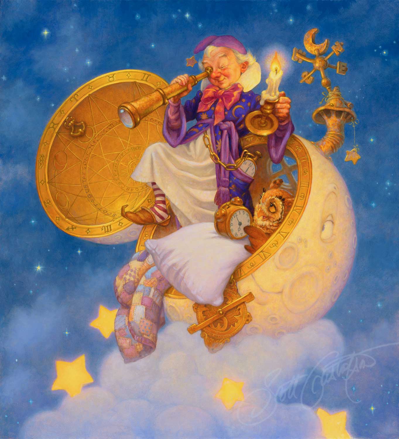
Finished painting
finished painting
This original oil painting was purchased by a private collector, but this image was made into a limited edition print by The Greenwich Workshop, and a few artist proof prints are still available for sale directly from our studio.
PLEASE CLICK BELOW FOR A LINK TO THIS PRINT IN OUR SHOP
"The man in the moon"
Oil on panel
20" x 22"
Here's how my time broke down on this piece:
- The drawing for the figurine, including the thumbnails and rough sketches, took approx. 2 days to complete.
- Shooting the reference and reworking the drawing for the book took about 4 days.
- Transferring the drawing, creating the color study, and the imprimatura took an additional 1.5 days.
- The underpainting took about 2 days, and from that point until completion took approximately another 4 days.
So, from start to finish, this painting took about 14 days to complete.
This painting has a lot of sentimental value to us, primarily because I used photographs of my late father-in-law, Norman Olson, as the basis for the character. He not only served as a wonderful model for this piece, but for many of the Santa Claus pictures I have done over the years.