
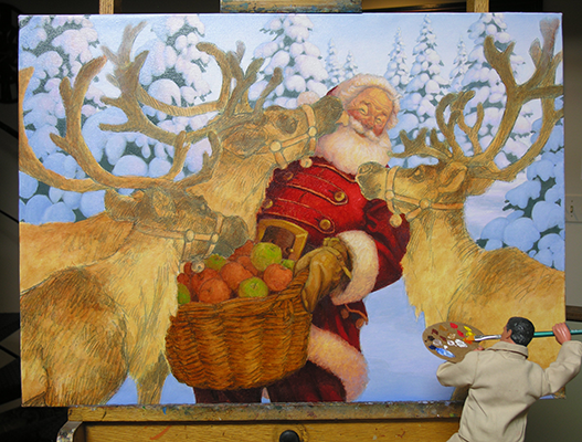
“Santa’s Treat!” - oil on canvas stretched on a panel, 27” x 19.25.” SOLD, but available as a giclee canvas!
santa’s Treat!
STEP-BY-STEP PROGRESSION OF AN OIL PAINTING
A few years ago, I posted step-by-step images showing how a Santa painting was created, and since lots of people seemed to enjoy it, I'm reposting it here on the site. Please keep scrolling to see the full progression! Thanks! —SG
#1: THE ORIGINAL DRAWING

In 2009, I did a graphite drawing of Santa feeding apples to his reindeer, entitled "Santa's Treat." The drawing is approx. 13" x 8," and we used this as the image on our family Christmas card that year.
In June of 2014, I came across a copy of the card drawing in a file and thought it might be interesting to revisit the idea...
#2: ROUGH DRAWING

In a revised rough sketch, I moved things around a little and made Santa literally the high point of the composition. I liked this adjustment and decided to use a little window of time in my schedule to take it to the next step of shooting photo reference...
#3 - PHOTO REFERENCE...

Dressed in a make-shift Santa costume (complete with padding), and holding a bucket as a stand-in prop for the basket of apples, we set up the lights, and my son Karl took a bunch of photos of me in variations of St. Nick's pose.
After they were shot and printed, I edited them and taped the selected shots to pieces of old cardboard. I grouped them in ways that would show me a range of possibilities, in similar poses.
At this point other commitments forced me to set this project aside until later...

...AND SANTA STUDY
When I got back to this project, I referred to my photos and did several studies of Santa, and this is the one I was happiest with.Over-laying a xerox of the study at the size I wanted to work at for a compositional study, I then began drawing the reindeer in position around Santa...
#4: COMPOSITIONAL STUDY...

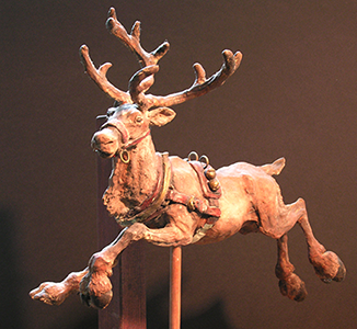
This is the finished arrangement of the figures. I decided to turn Santa a bit more toward the viewer for the finished composition. For reindeer reference, I relied on a picture file I've kept for years of reindeer and caribou photos, and a sculpture I made of a leaping reindeer (below) years ago while illustrating "The Night Before Christmas."
...AND REINDEER!
Reindeer antlers are always a challenge when planning a composition in which these great animals are featured. It took a bit of finessing to choreograph them in a way that they looked natural and interesting as antlers, but didn't get in the way or line up with other elements and form awkward tangents. As the picture developed, I was pleased with the way the sweep of the antlers helped lead the viewer to Santa's face.
#5 - CROPPED SKETCH

Once I got this sketch worked out (at about 10" x 8"), I cropped it to 7" x 5," the proportion I wanted for the finished piece.The next step was to enlarge that cropped sketch up to a good size to work at for the final drawing, approx. 18.75" x 13.25." I did this on our home copier machine.
At this stage, I have spent about 2 days working on this piece.
#6: THE DRAWING BOARD

I taped the enlargement of the compositional sketch to the drawing board, put a sheet of some semi-transparent layout paper over that, and started redrawing the elements. I like doing it this way because the sketch is just that - a loose version of the composition done to work out the design and arrangement of a picture. The final drawing fine tunes things, adjusting and working out the details before taking the piece to canvas.
This photo basically shows how the drawing board looked while working on the finished drawing. The iPad (upper left) happens to have a picture of our dog, Riley in this shot, but it displays all manner of visual reference throughout the work day. Next to that is the progression of drawings and sketches prior to this point in time. Way over to the left, on the table is the reindeer sculpture.
You may also notice cut-outs of xeroxes of drawings of a reindeer (to the left of the main drawing) and Santa (to the right). All the key figures in this piece were drawn on separate sheets of layout paper, then xeroxed, cut out and put into position. This is an archaic way of allowing me as much flexibility as possible when arranging the elements. I can also reduce or enlarge each single element as needed. Once I get the picture to the right size, I wax the back (with a 30-yr. old hot wax machine that I inherited!), put it into position on the composition and burnish it down. Although the cut out reindeer is like the one in the lower left of the sketch, I decided to adjust its pose for the final composition.

Joe doesn't seem to realize that his eraser is of no use on the xeroxed images, but I didn't have the heart to tell him...
...AND JOE!
You have undoubtedly also noticed by now my helper, Joe. Because I couldn't shoot the photos and be in them at the same time, Joe consented to be photographed while working. Here he is, literally propped up on much of the stuff that helps form the foundation for this picture; reference books, picture files, CDs of great music to listen to, and last but not least - a cup of coffee.
STEP #7: THE FINISHED DRAWING

This is how the final drawing looked with everything in place. The trees in the background were drawn in pencil around the group of figures. My wife, Patty, scanned this drawing and we sized it to fit a masonite panel that I had cut to 27" x 19.25."
We then sent this image via the computer to a local company that can print out hi-res images on canvas. Usually the turnaround for this process is within the same day.
STEP #8: PREPPING THE COLOR STUDY

While waiting for the canvas, we printed out a small version of the drawing on letter-sized paper, and then I reduced it a bit more on our copier machine and printed it out on a sheet of white Canson MieTentes paper. Then the copy was spray fixed and once it was dry it was soaked in water, and then, using brown paper, watercolor tape, it was taped down to a small drawing board.
Unfortunately, this tape doesn't always hold, and as the Canson paper dries and shrinks, it sometimes pulls itself out from under the brown tape. I have, therefore, taken to blow drying the brown tape to the point of getting the surface dry to the touch. Then, I re-tape the edges of that tape with standard masking tape, which helps hold things in place and causes the white paper to dry perfectly flat and ready to work on. This is going to be used as the color study.
Even though I have already applied all the necessary masking tape, Joe still wanted to help out. What can I say?
STEP #9 - DARK AND LIGHTENED IMAGE

Because the black pigment in the copier toner is too harsh, I soften it with a coat of Golden Acrylic absorbent ground, a sort of gesso that remains semi-transparent and pretty absorbent to washes.

Here, Joe shows us the difference between the copier black and the softened version.
STEP #10: THE COLOR STUDY

The color study was then done directly on this mounted copy, with acrylic paint. I had a very clear idea of what the color might be (for once!) and this study was completed in just a couple of hours.
They don't all go this smoothly, however. Many times, I spend a full day on one study, or end up doing several versions before getting what I want.
At this stage, I'm about 6 working days into this piece.
STEP #11: JOE AND THE SCRAPER...

Once I had the canvas with the printed image of the drawing, I gave it two coats of spray varnish. I used Krylon UV-Resistant Matte Clear Acrylic Coating. This helps hold the ink to the canvas and makes it resistant to moisture, which I need to do before the next step.
Once that is dry (about two hours), using a large paint brush (about 2" wide), I gave the masonite panel a thick coat of Golden Matte Gel Medium. Then, I position the printed canvas face up onto the masonite, so that the crop marks line up with the edges of the masonite. Then, using a plastic scraper, like the one Joe is holding, I squeegee the surface of the canvas, forcing it tightly against the masonite. This also forces any excess gel medium to the edges of the panel, which is then wiped away. Once all the bubbles of medium are forced to the edges, and the canvas is perfectly flat and adhered to the masonite, I allow the canvas to dry - usually overnight.
The next day, I fold the extra canvas around to the back of the panel and adhere it in place with more gel medium. Once that's dry, I use more gel medium to glue down a sheet of heavy paper across the entire back of the panel and over the edges of the folded canvas. (Joe is demonstrating this step above).This helps hold the folds in place and leaves a nice, clean finished surface. I also let this dry - for about 8 hrs at least.
STEP #12: JOE AND THE ROLLER...

Here we see Joe rolling on the second coat of matte medium to the front of the canvas panel. This is just extra protection for the image, since I'll be doing the first part of my underpainting in water-based acrylic.

Oh no - Joe is being watched by a large predator! Fortunately, he always plans a defense strategy, if needed...
STEP #13: THE STRETCHED CANVAS

This is a great surface to start painting on. I go to the extra trouble of having my actual drawing printed on the canvas because I prefer it to the other method of transferring it through the drawing with graphite paper.
Even though I still use that approach (depending on the job), I like the quality of this printed drawing to the bad tracing quality of the graphite paper transfer.
STEP #14: THE IMPRIMATURA

The Imprimatura has transparent glazes made up of acrylic paint mixed with matte medium, primarily yellow ochre and raw sienna on the figures, and dioxazine purple mixed with white and a touch of ultramarine blue on the background. This simply gives you a general tone and color to start building the rest of the painting on.
This step took a couple of hours to do.
STEP #15: BEGINNING THE OIL PAINTING

In about a half a day, I laid in this much color in oil on the figure of Santa and the basket of apples. It is now that my color study becomes an invaluable guide for the rest of the picture. Even though this step is primarily intended as a foundation to paint on top of, if done right, much of this work will be visible in the finished painting as well.
My pictures are usually made up of various layers of paint, each hopefully adding to the whole.
STEP #16: OIL PAINTING CONTINUES...

This shot shows the oil color underpainting on Santa's face, coat, basket and apples. This first use of oils in the painting is basically a glaze of color on these areas, spending a little more time on the face of Santa, trying to establish values in paint, and covering the lines of the transferred drawing.
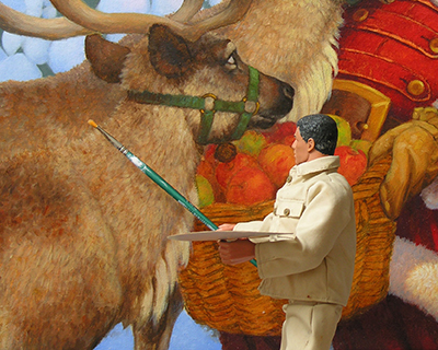
Joe is always happiest when we reach the oil painting stage.
STEP #17: WORKING ON THE BACKGROUND...

For the background, I started painting the closest trees, the snow on the ground and the sky. I like to establish an environment before working in depth on main characters, I feel that they then fit into that space as opposed to painting a space around them.
Joe feels the same way.
STEP #18: MORE ON THE BACKGROUND, THEN SANTA'S COAT...

Today I painted the rest of the trees and did a little more work on the trees from yesterday as well. I think the background is basically done now.
Then I started working on Santa's coat, belt and mitten. I painted these fairly quickly wet on wet; I'd like to leave them like this, but we'll see how they look as the elements around them start to get finished, as they may need a tweak here and there so that everything works together.
I hope Joe adds a cooler red to his palette before he starts painting...
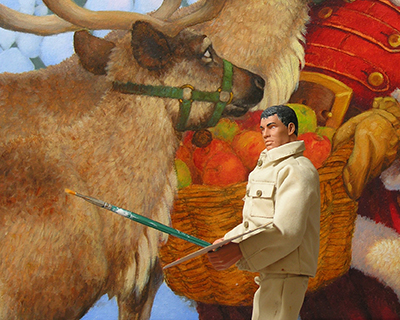
STEP #19: LIVE REINDEER! HALF A DAY...


For years, my wife, Patty has been telling me about the live reindeer that a north suburban garden center has on location at Christmastime. This year, I finally made a point of taking my camera to see for myself, and man, was I happy I did!
Getting reference from books and online is great, but when you can stand a foot away from an actual reindeer and see the beautiful colors and the thickness of the fur - well, there's nothing like it, and the timing couldn't have been better for this painting!
STEP #19 1/2: BACK IN THE STUDIO...

That afternoon, back in the studio, I made a first pass at Santa's face. I will continue to make adjustments to his face as the painting proceeds, but this half-day's worth of work has established the basic foundation, and once it's dry I will always have that to go back to if future adjustments don't go well. I also worked on the fur trim of Santa's cuff and coat.
Varying from the color study a bit, I laid in three different colors on the reindeer's halters: originally I planned to make them all a reddish brown, but thought it might be nice to add some more color to the picture by making them green, orange and reddish brown. I'm not sure about this, so we'll see if I leave it or not.

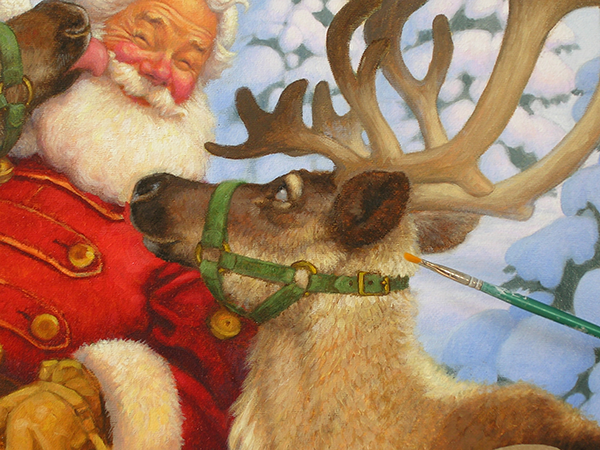
Detail of Santa's Face

It always amazes me that Joe uses the same size brush for everything.
STEP #20: SANTA'S FACE, THE REINDEER AND SKY...


Detail of Santa’s Face
Today I worked some more on Santa's face - I made his nose a little less wide, made some slight adjustments to his cheeks, wrinkles, beard and hair. Then I roughed in the licking reindeer. (By the way, sorry the fresh paint caught some reflections on the reindeer - his back portion and antlers are actually a little darker than they appear in this shot).
I also darkened the sky. I originally liked the light "snow sky" of the first sky, but decided I wanted more contrast between it and the trees, so I darkened it. I also added some of that blue to the reflected light areas of the tree's shadows.
STEP #21: MORE WORK ON THE REINDEER, AND SANTA'S FACE


I've got to hand it to Joe. He's willing to put himself in peril for the sake of the piece. He is suspended about 40 feet (in Joe "scale") above the studio floor in this shot.
Today I finished the "licking reindeer" and made some adjustments to the side of Santa's face that is being licked, deepened those wrinkles, and added a little more shape to the cheek. I also laid in the color on the reindeer to the right.
STEP #22: REINDEER AT THE RIGHT, AND LIGHTENING SANTA'S BEARD
Somehow, Joe always makes his presence known.
I think the reindeer on the right is done now - boy, did that reindeer photo reference come in handy on this guy! As you can see, I also changed the halter from orange to green to match the licking reindeer. I think I prefer this, as it helps to unify the deer, and the green looks good next to the red of Santa's coat.
I also heightened the white of Santa's beard and the fur of his hat, and cast a shadow from the reindeer onto Santa's left arm.
STEP #23: WORKING ON THE FOREGROUND REINDEER

Today I concentrated on the left foreground reindeer, and made adjustments to his face in order to make him look a little less "moosey." I think I'll be spending a little more time on this guy tomorrow...

Joe is just wondering if I got the shot yet.
STEP #24: REINDEER WORK CONTINUES...

I continued to work on the left foreground reindeer, adjusting his halter and lightening his eye, among other things. I also softened the edges of the licking reindeer, so he would recede a little more.
I intended to work on some other areas, but there was a little tension in the studio between Joe and I. He wanted to continue to work on the reindeer, and I wanted to proceed on to the basket and apples.
I repeatedly asked him to move, so that I could get to that area, and as you can see from the following sequence, there was some insubordination. The cat thinks I should write him up.
STEP #25: THE BASKET OF APPLES

This page in the sequence actually covers about two full days of working time in the studio.
On the licking reindeer, I decided to move his legs apart, so they'd read better as two separate legs. I also deepened the shadow beneath the basket on Santa's legs.
In this time period, I also finished painting the apples and the basket. When it comes to things like this, I always enjoy setting up a little still life in the studio, and painting directly from it. It's not only fun, but I think it also helps me as a painter to work from life whenever possible, instead of constantly relying on photo reference.

When I came back up to the studio after lunch, it appeared that something had gotten into the basket of apples. So that evening, I decided to set the camera up on a tripod, trained on the still life, and rigged up a motion sensitive trigger for the shutter. The next morning, this photo was all the proof I needed.
The cat wanted me to throw Joe in the brig, but given how hard he's been working lately, I decided that if he's really that hungry, we should probably increase his K-rations instead.
STEP #26: MAKING A LIST, AND CHECKING IT TWICE...

Today I was at the point where I needed to review what still had to be done in order to finish the painting, and I made a list of those things. This really helps me to remember them all, since many of them are very subtle, and unless I make a note of them, they will be overlooked. I think these kinds of subtle adjustments really help to tie a piece together. I've always thought of this step like the final rehearsal before a performance of an orchestral piece of music - a point at which the conductor asks the orchestra for more brass here and a little less kettle drum there. It's a process of fine-tuning a piece so that passages are either heightened or subdued, according to where the desired emphasis is supposed to be.


Joe actually hates these days, and thinks they are as interesting to witness as it is to watch paint dry. He usually passes the time in the studio by playing his guitar.
The trouble is, the only thing he can play is the opening bars of "Smoke on the Water." This would drive the cat and I nuts, but thankfully, Joe doesn't seem to realize he needs an amplifier for his axe.
STEP #27: RETOUCH VARNISH


Sometimes when darker oil paints dry, they lighten in value, or "sink." Because it's necessary to restore those areas to the same intensity that they were when wet, a coat of retouch varnish is needed. This can be applied when the paint is dry to the touch (usually the next morning, or longer) and often the varnish itself is dry to the touch in 30 minutes to an hour. The basket was one such area. Here is a shot before and after the coat of retouch varnish. The difference is more obvious in person than in these photos.

Applying retouch varnish is one of Joe's favorite tasks, because it offers such immediate results. This day, however, the neighbor kid, Gumby, dropped by, and even though he and Joe basically grew up together, Joe thinks Gumby acts too immature. He particularly dislikes when Gumby mugs for the camera.
The rest of the work today was a continuation of the previous day's finishing touches. After the retouch varnish dried, I also put a glaze of burnt sienna on the lighter areas of the basket and heightened some of the color on a few of the apples.
I usually lay the piece flat when applying the varnish, so it doesn't run down the surface of the painting.
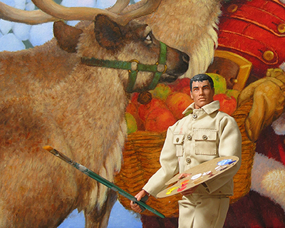
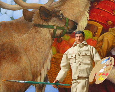
STEP #28: THE FINAL PAINTING OF "SANTA'S TREAT"!

There were just a few small changes to make on the painting - the bells on the reindeers' halters were finished, the brass work brightened, and the straps across the very tops of their noses lightened to help them stand out a bit more.
I also added blue to the shadows of the evergreens - this strengthened those shapes and seemed to help separate those darks from the warmer darks of the foreground characters.
And now, believe it or not, the painting is actually done! I signed it and may make some very subtle adjustments over the next few days, but as of today I feel I can finally say "Santa's Treat" is finished.
Thanks so much for following this progression, and I want to personally wish you a very Merry Christmas and a Happy New Year! --SG

Joe has put in plenty of overtime on this one, and I'd like to thank him for all his help, and wish him a well earned rest. "May visions of sugarplums dance in his head."